Nav to e-comm
Turning a lab exam scheduling app into an e-commerce experience
Design process in Dasa context
Nav is a Dasa app that aims to unite all laboratories of the chain. Exams, vaccines and consultations can be found in one place.
More than 50 designers work on several teams that focus on product improvements.
With the whole system already up and running sprints that focused on developing MVPs, like every product, after the first implementation and observation phase, need of improvements were being found. Some of them were related to issues that met company goals and the patient experience.
The problem

Convertion rate of 45% was considered alarming
My design process for this project
Data review
Research & User Testing
Priorization
Initial data review
First, we reviewed the user's profile to better understand their behavior when analyzing data from Analytics and Hotjar. Some of the insights we had were quite surprising:
Users were older than we thought;
Users were having trouble not only with our app in general, but they were not as familiar with browsing in a cellphone at all.
This clearly showed us we had a bigger challenge to beat. We realized that the user was being kept from finishing our golden path, which in this case was to successfully schedule multiple health exams in multiple laboratories, yes, but also led us to question: what was our app's fault and what was an external issue? We needed a research.
Gathering data to know the user

Users with trouble scheduling
28% Find dates and times consistent with needs
11% Find lab with convenient location
11% Understand which exams are being ordered
41% Show no difficulty
21% Has difficulty in the whole process

What's essential for scheduling
63% Availability of dates
61% Find the unit closest to work, home, etc.
38% Make appointments, schedule and withdraw exams in the same place
38% Find out if my insurance is accepted
17% Being able to choose between
more than one laboratory brand
Personas


How can I contemplate both personas?

The team decided than to turn the experience into an e-commerce like one. This would be the first major decision that would cover all users.
We thought like this: an e-commerce is a common thing since forever, so it should be an easy navigation. Everybody must have bought something online, right? Not quite.
It worked perfectly for younger users. Things started to get rough for the older ones. We came to find out they were not as familiar as we thought with the e-comm concept. We ran usability tests and we found that:
• A cart icon was not immediately recognizable;
• The cart icon reminds the user of something they have to pay. Not necessarily our case here;
So with that in mind, we had to introduce the concept for the user. We used an onboarding appearance to explain them what would happen when they added an exam to the cart, as in the image beside.
Turns out…
This way we were able to think of a flow that put together all needs. The main goal here was to reach the user that for some reason abandoned the flow and make possible to start off where they left. Given that laboratory tests are really hard to understand sometimes, the user would constantly find themselves having to reach out to the doctor, researching for some synonymy and so on. This is what differs our product from a regular e-comm experience. Nevertheless, we were able to build this flow:
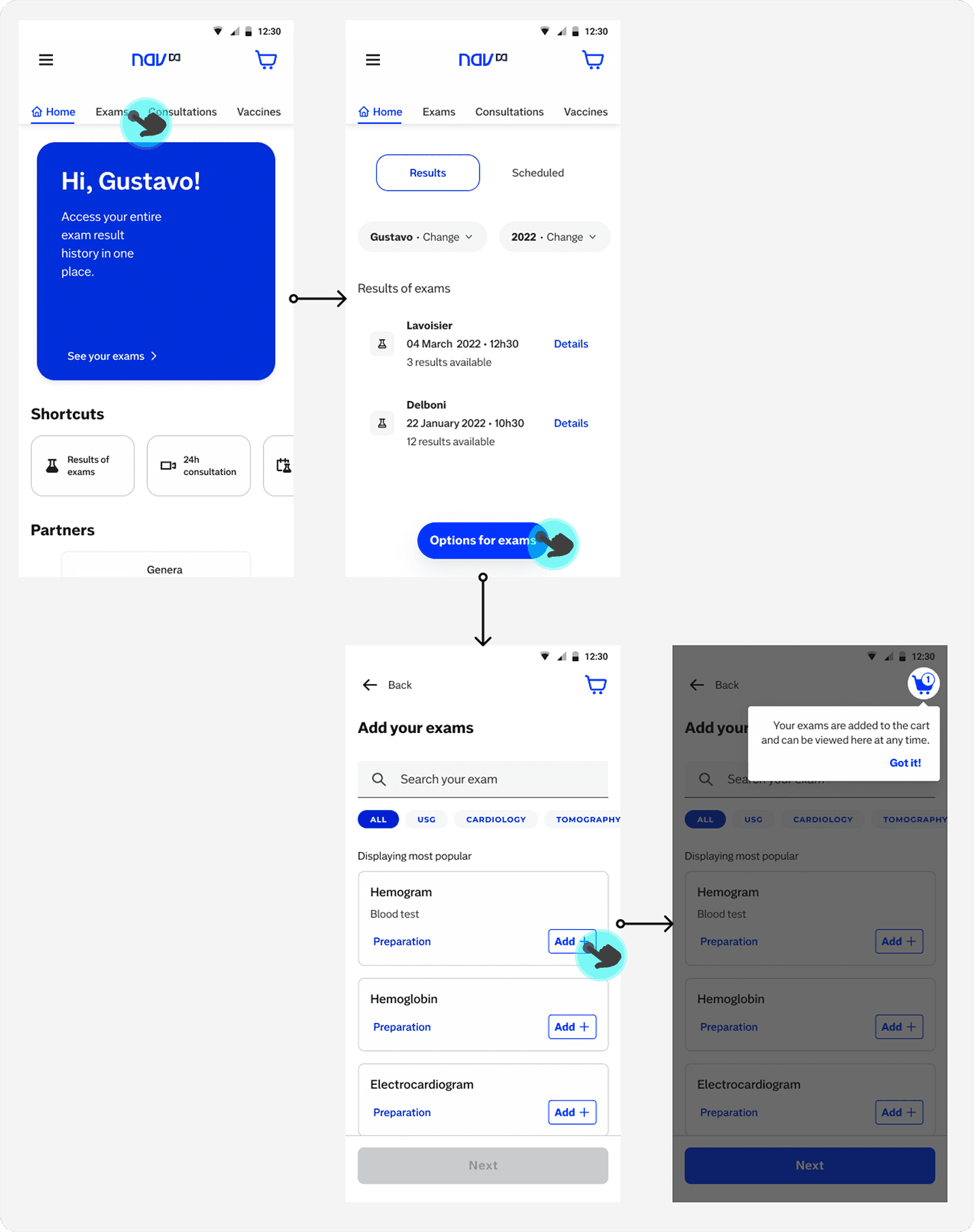

Also I gave the opportunity for the user to review the cart, of course, like in the image.
That way the user would be able to resume his journey every time they left the flow.
This was the prototype used for the tests
Exemple of handed off screen
This is how the screens were handed off to the develop team. First we identify the Alma (Dasa Design System) components, then the components I had to create for the specific screen.

Next steps
After all consideration and everything implemented as we thought, now we just have to follow the performance of what we are offering now for the user. We hope we can at least increase the conversion rate in 20% by doing this alone. After that, the goal is to manage expectations and set new targets. For that, we are going to use the following cycle method:

